
| | |  Entertainment | Books | November 2008 Entertainment | Books | November 2008 
Mapping Out a New World Order
 Matthew Knight - CNN Matthew Knight - CNN
go to original
| Take a close look at this map. What’s happened to our familiar world?
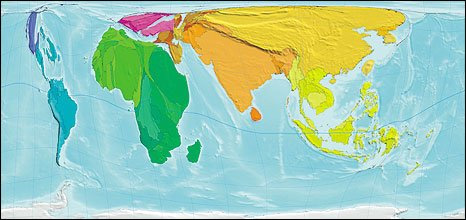
This is the map of human poverty — showing the proportion of poor people living in each country.
The size of each country/territory shows the overall level of poverty, quantified as the population of the territory multiplied by the Human Poverty Index. The index is used by the UNDP to measure the level of poverty in different territories. It attempts to capture all elements of poverty, such as life expectancy and adult literacy. | | |
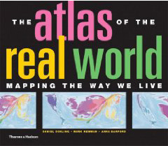
A new book, The Atlas of the Real World, has redrawn the map giving vivid new insights and bringing economic, social and environmental data to life.
Not since the German meteorologist, Alfred Wegener, sketched out the first detailed theories of continental drift has the world appeared so misshapen, so otherworldly.
The 366 cartograms (statistical maps) which make up the book twist, shrink and distend countries and continents into all sorts of shapes and sizes.
 The book and the accompanying Web site were devised by Daniel Dorling, professor of human geography at the UK's University of Sheffield, Anna Barford, a research associate at Sheffield and Mark Newman, a professor of physics at the University of Michigan. The book and the accompanying Web site were devised by Daniel Dorling, professor of human geography at the UK's University of Sheffield, Anna Barford, a research associate at Sheffield and Mark Newman, a professor of physics at the University of Michigan.
Work on the project began in earnest in 2006 when Dorling teamed up with Newman, who had co-created a new software technique for creating equal area cartograms the year before.
With the software in place, the painstaking task of assembling the data began. The information was drawn from a variety of organizations including the United Nations, the World Health Organization and the World Bank.
The range of subjects is impressive, from greenhouse gas emissions, wealth and disease to more obscure data about numbers of dentists and working tractors.
John Pritchard, research assistant at University of Sheffield and part of the team working on the project, told CNN: "I think the maps of disease are particularly shocking and bring home the scale of the problem in Africa better than a table of statistics does."
Indeed, the map of malaria deaths is striking: 94 percent of deaths from malaria occur in Africa, making the continent appear like a vast bloated blob. The rest of the world is reduced to a disparate series of veiny streaks.
There are other sobering statistics to consider. In June 2008, Principal Voices spoke to Head of Research at Oxfam GB Duncan Green about strategies to eradicate poverty. Green talked about the education being crucial to breaking the cycle of poverty, particularly for girls.
The new atlas's Girls not at Primary School cartogram graphically illustrates the lack of female education in many parts of the developing world.
Team members are currently working on a map of languages and soon hope to be producing animated maps.
"We have a series of maps that show deaths at various stages, which would be particularly suited to an animation, and we now have a PhD student looking at extending the Web site, including ways of mapping flow." Pritchard said. |
|
| |

