
| | |  Travel & Outdoors | March 2009 Travel & Outdoors | March 2009 
Mexicana's Bold Re-Brand
 Daniel Gomez - PVNN Daniel Gomez - PVNN
| | As one of the biggest carriers between the US and Mexico, Mexicana is one of the most visible and international of Mexican brands. | |
The fact that Mexicana de Aviacion re-branded is no surprise. The airline's brand identity had become antiquated over the years as newer, bolder and more youthful airlines entered the domestic market. Companies like Interjet, Alma de Mexico and Volaris captured the imagination and the disposable income of travellers weary of outdated service offers and messaging of the leading carriers.
Volaris launched a daring campaign that insinuated a different approach to customer care. The campaign introduced their planes by name, imbuing normally inanimate objects with personality and notions of intimacy and trust. This implied intimacy positioned Volaris as a friendly, modern alternative to the behemoths of the past century.
Whether Volaris's strategy and campaigns can save it from the same fate as the now-defunct Alma de Mexico remains to be seen. What is clear, is that Mexicana's rebrand could not have come at a more interesting time as the travel industry braces itself for another round of route cuts and industry losses while the world economy seemingly collapses limply onto itself.
Mexicana's decision to invest in its brand runs counter to standard practice during economic downturns - slash marketing budgets and staff, cut advertising and retrench. The amount or time invested has not been revealed, but reinventing a national icon is fraught with challenges at the best of times, re branding during an economic downturn is either a sign of lunacy or brilliance. For Mexicana, the jury is still out.
The challenge for iconic national brands is the unrealistic expectations consumers place on them. We think we 'own' the brands and often voice more insights and opinions than the team responsible for creating and managing them.
Love them or hate them, successful national brands come to represent our national psyche. Telefonos de Mexico (Telmex) and Petroleos Mexicanos (Pemex) are 2 national icons that have come to represent the very best and worst of Mexican brands.
They stand equally for Innovation or obsoletion, efficiency or waste, competitiveness or monopoly, depending on critic. But everyone does have an opinion. One need only consider the recent consultation across Mexico on the future structure of Pemex to see how emotionally charged the debate became despite a glaring lack of information on the subject in the public domain.
Carlos Slim's, Telmex's biggest shareholder, recent promotion to the post of the richest man in the world, however briefly, turned him into a hero and Telmex into a symbol of national pride. Mexico entered the big leagues. Slim's success was our success, Telmex, a very Mexican company in name, identity and philosophy, was our company. It reasserted itself as the face of Mexican business to the world.
Sadly for brands, our expectations are high while our patience is low not only in Mexico, but globally. In the United Kingdom in 2002, the Post Office Group re-branded as Consignia to signal a consolidation of services and its first steps towards privatisation to outcries of budgetary waste and mismanagement.
The British public quickly forgave previous complaints of inefficiencies, lost mail and heavy annual losses and demanded the government intervene and the rightful name be restored. The new brand was quietly shelved in 2004 with the name reverting back to the Post Office though the changes in strategy went ahead without much fanfare.
Paradoxically, the recent rebrand of Correos de Mexico received very little national attention, a sign perhaps of the state organisation's decreasing relevance to ordinary Mexicans, despite the new make-up.
Mexicana does not directly impact on the lives of Mexicans as do Telmex or Pemex. It is however one of the most visible and international of Mexican brands simply because of the nature of its business, it travels to almost 50 international locations and is the biggest carrier between the US and Mexico.
The rebrand was intended to reposition the company as a leader in passenger comfort, creativity and innovation in order to instill a more pleasant and memorable travel experience for the passenger according to Manuel Borja, Director General at Mexicana, in a press release earlier this year.
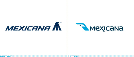
As such, the change reflects a confident and optimistic outlook that may be a breath of fresh air for an industry in despair. The stylized eagle lightly references the root of Mexican identity in a modern context. The X in the name appears caught in mid-take off, though the concept may have been better served through a more confident use of the iconic eagle.
The color palette, while constrained, is corporate and serves to position Mexicana as a serious contender in the international arena - the flip side is that Mexicana now shares corporate colors with many of the world's leading airlines including it's biggest rival AeroMexico.
While the rebrand can be considered an over all success - the Mexicana brand is now modern and comfortable, Mexicana is backing this up with considerable investment in technology - it appears that Mexicana and its creative agencies fell foul to the same thinking British Airways (BA) succumbed to when it re-branded in 1997.
BA dropped the Union Jack, or British flag, from its tail fins and replaced it with a well designed if ill-received international 'ethnic designs.' There was public uproar. Britain was insulted by BA discarding the very essence of Britishness and its attempt broaden its appeal and go 'global.' Virgin Atlantic, BA's confirmed arch enemy never one to pass up a good PR opportunity, emblazoned the flag design across its entire fleet to proclaim itself Britain's only true flag carrier.
In Mexicana's case, the re branding exercise failed to leverage the rich heritage found in the aztec-influenced design of the previous logo. The former identity proudly trumpeted our national heritage and championed it to the world simultaneously promoting itself, our culture and Mexico as a destination every time it landed, and we loved her dearly for it. By discarding the iconic logo, Mexicana may have jeopardized the brand equity it has built over the past 90 years.
Because few brands can boast the robustness, luck and public goodwill enjoyed by brands like Coca Cola they need to continually learn, adapt, and evolve. Mexicana and its agencies should be praised for their boldness, but may have reconsidered discarding the carrier's rich heritage altogether.
Change for change's sake is risky. In order to succeed and engage consumers, brands must focus on the very best of what they are and celebrate the attributes that led to their success in the first place.
Only time will tell if Mexicana's bold new strategy to focus on an international market and technology was at the expense of its cultural heritage and existing customer base. One can only hope their boldness is rewarded.
 Daniel Gomez is a brand strategist and partner at Mijo. Based in Puerto Vallarta, Mijo is a strategic brand design agency servicing clients across North America and Europe to create breakthrough brand communicatiuon solutions. To learn more about Mijo Brand Strategy Design, call (322) 223-2837 or visit mijo.com.mx. Daniel Gomez is a brand strategist and partner at Mijo. Based in Puerto Vallarta, Mijo is a strategic brand design agency servicing clients across North America and Europe to create breakthrough brand communicatiuon solutions. To learn more about Mijo Brand Strategy Design, call (322) 223-2837 or visit mijo.com.mx.
Click HERE for more articles by Daniel Gomez. |
|
| |

